↖
Go to Main
Trackup

Trackup
Making budgeting usable in real life
Mobile
B2C
Overview
TrackyUp is a mobile-first budgeting experience designed for real-world usage — where attention is low, tracking is inconsistent, and financial decisions happen in the moment.
Instead of adding more features, the focus was on reducing the effort required to build a sustainable habit.
Problem
Budgeting doesn’t fail because people lack intent. It fails because the tools don’t align with real behavior.
Most budgeting apps:
1. Require effort at the wrong time
2. Interrupt real-life moments
3. Feel rigid or overwhelming
4. React only after overspending
As a result, users start with intent — but rarely sustain the habit.
Context
Most tools assume users will:
1. Sit down
2. Plan finances
3. Track consistently
But real usage is reactive.
People open budgeting apps when something goes wrong:
1. A failed transaction
2. A low balance alert
3. A moment of financial anxiety
This creates a gap between how tools are designed and how they are actually used.
My role
As a Freelancer, I collaborated closely with the client and engineers to define the user experience for tracking flow. I led the end-to-end design process, from discovery to final UI bringing in user-centered thinking, wireframes and high-fidelity prototypes. My role was to ensure that design aligned with business goals while maintaining a seamless and intuitive experience for users.
Research
To understand this gap, I combined personal experience with lightweight validation:
1. Survey with 40+ participants
2.LinkedIn polls
3. Competitive analysis of 6+ apps
The goal was to reduce friction at the moment of action and make budgeting a habit users could realistically sustain.

Ideation
The design philosophy revolved around effortless simplicity. Every interaction was crafted to minimize friction and guide users naturally through the payment process.
Friction-free expense tracking
Problem
Existing apps required too many steps to log a simple expense.
Decision
Reduce expense logging to a single-step action.
Why
In real-world usage, users prioritize speed over structure.
Solution
1. Open app → Add amount → Done.
2. Optional categorization later.
3. Smart SMS parsing (with permission).
4. Local processing (privacy-first).
Remove heavy onboarding
Problem
Users dropped off before experiencing value due to upfront setup.
Decision
Replace onboarding with progressive disclosure.
Why
Reducing cognitive load early increases adoption and trust.
Solution
1. No mandatory setup at entry.
2. Features introduced gradually.
3. Contextual prompts instead of upfront forms.
Make financial status instantly clear
Problem
Users struggled to interpret dashboards and numbers quickly.
Decision
Replace data-heavy views with state-based grouping.
Why
Users need quick understanding, not analysis.
Solution
1. Categories grouped as:
a. Under budget.
b. Near limit.
c. Over budget.
2. Visual color indicators (green / yellow / red).
3. Key insights surfaced upfront.
Prevent overspending before it happens
Problem
Most apps notify users only after overspending.
Decision
Introduce proactive, buffer-based alerts.
Why
Users need time to adjust behavior before crossing limits.
Solution
1. Custom thresholds (e.g., 80%).
2. Alerts before limits are reached.
3. Neutral, non-judgmental tone.
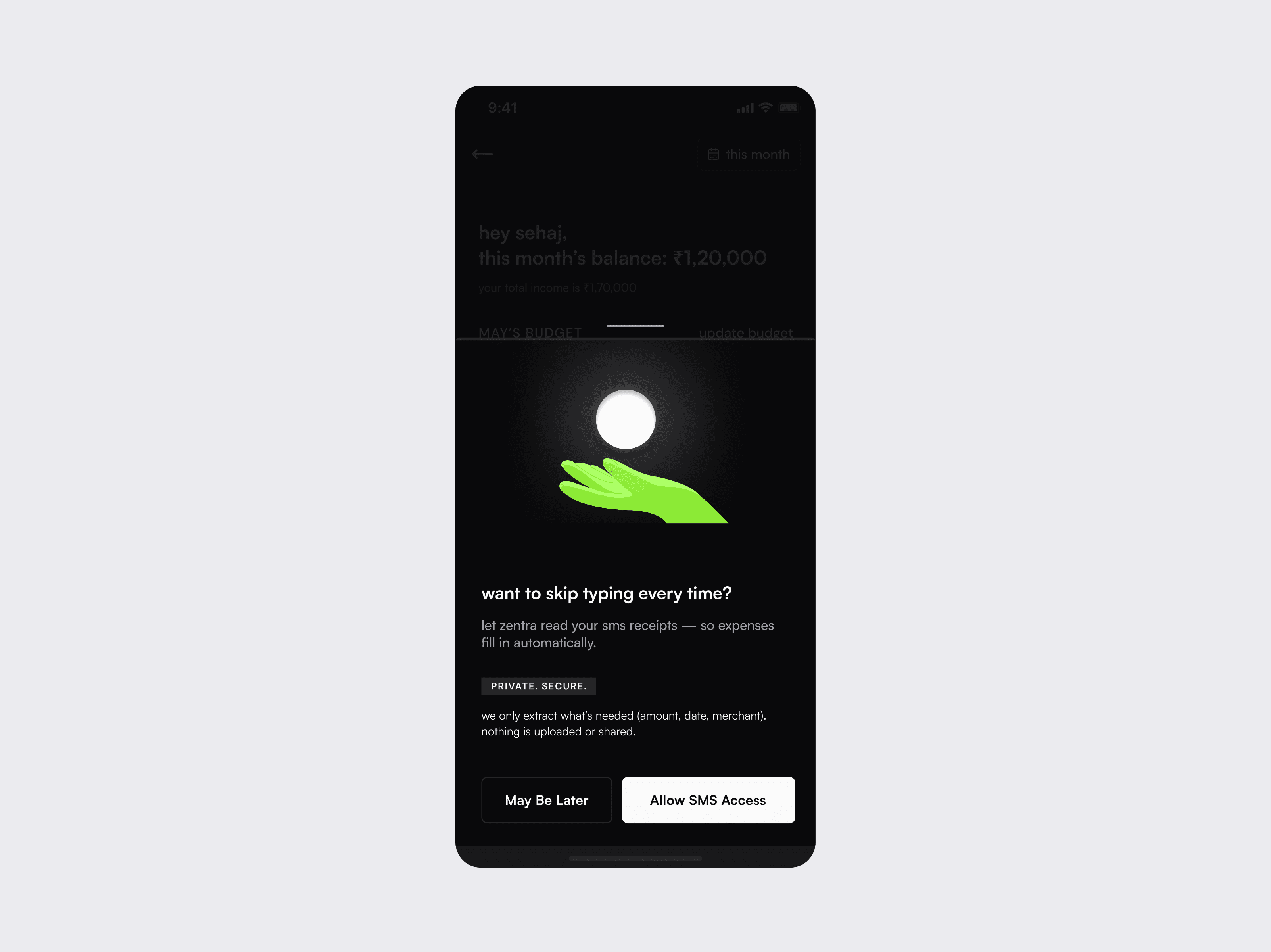
Balance automation with user trust
Problem
Automated tools either created noise or required intrusive access.
Decision
Enable permission-based, local automation.
Why
Users want convenience without losing control or privacy.
Solution
1. SMS parsing with explicit consent.
2. Local data processing (no server dependency).
3. User retains full control over entries.
Reduce friction for offline expenses
Problem
Manual entry for offline purchases increased effort.
Decision
Introduce bill scanning with OCR.
Why
Maintains low effort across both online and offline transactions.
Solution
1. Scan or upload receipt.
2. Auto-extract amount, merchant, date.
3. Editable fields for accuracy.
Testing
Tested with 6 users, focusing on speed and first-time experience.
Key observations:
- Faster task completion in quick-add flow
- High adoption of bill scanning
- Positive response to proactive alerts
Closing notes
Designing TrackyUp reinforced a simple idea — the most effective products don’t add more features, they reduce the effort required to use them.
This principle continues to shape how I approach product design.
Read Next
Earn markets
Market Deposit
$97689.32
Net Apr
3.476%
Market
Price
Wallet Balance
Liquidity
Net Apr
USDC
60.81K
23.879
9.780%
$1.0000
Supply
USDT
43.39K
19.989
13.850%
$1.0000
20.3%
Supply
37.118
0.280%
51
wETH
$2.751k
12.8%
Supply
$97.77K
0.0664
1.570%
0.000
wBTC
Supply
My Positions
Total Positons
$567.876
Net Apr
3.476%
Market
Value
Apr
3.347%
21.487
Withdraw
Add
rUSDC
21.487
3.347%
rUSDT
Withdraw
Add
0.9
3.347%
rETH
Withdraw
Add
Supply
Supply
1 rUSDC
1.20
USDC
rUSDC minted (est)
1234.5
USDC
Apr
0.15%
Supply apr
5.73%
HSTK rewards
5.73%
Fees
23.9%
Network fees
0.0003
ETH
Dapp fees
0.15%
Third party Dapp fees
5.73%
Amount
00.000
USDC
MAX
Wallet balance:
100.31 USDC
50%
0%
100%
75%
50%
25%
Select market
USDC
Hashstack
Earn
Borrow
03xf........768cvd
Hashstack
Simplifying a DeFi lending protocol for real-world users
Web3
SaaS
Web & Mobile
B2C
© 2025 Sehaj Sharma