↖
Go to Main
Hashstack
Hashstack
Simplifying a DeFi lending protocol for real-world users
WEB 3
SAAS
Web & Mobile
B2C
Overview
Hashstack is a permissionless DeFi lending protocol that enables users to borrow up to 500% of their collateral, offering significantly higher capital efficiency compared to traditional platforms.
It is designed for users who want to leverage their assets for trading or liquidity without relying on centralized approval systems.
Problem
The protocol was powerful, but difficult to navigate and understand.
Users struggled to:
1. Understand key concepts
2. Navigate between features
3. Track their positions
4. Take confident actions
This created friction in a product where clarity and trust are critical.
Context
Most DeFi products are designed around protocol structure rather than user intent.
This leads to:
1. Interfaces that reflect system logic
2. Terminology that assumes prior knowledge
3. Fragmented user flows
Creating a gap between:
how the system works vs how users think
My role
As a Product Designer, I collaborated closely with the stakeholders and engineers to define the user experience for tracking flow. During the platform migration from Starknet to Base, I led the end-to-end redesign of the product experience, working closely with the team to simplify complex DeFi interactions and make the platform more accessible to a broader audience.
The focus was not on changing the protocol, but on reducing the cognitive effort required to understand and use it.
Research
With limited time during migration, I relied on real user signals:
1. 1000+ Discord messages from early users
2. Feedback from active community members
These insights revealed consistent patterns in how users struggled with the product.
Ideation
The design philosophy revolved around effortless simplicity. Every interaction was crafted to minimize friction and guide users naturally through the payment process.
Users struggled to understand the product
Problem
Users frequently paused to interpret screens, searched for external explanations, and clicked without clear direction.
→ The interface required prior knowledge of DeFi.
Decision
Design for clarity without assuming user familiarity.
Why
Users should be able to understand and act without relying on external learning.
Solution
1. Simplified structure and clearer entry points.
2. Reduced dependency on technical understanding.
3. Guided interaction through clearer flows.
Navigation was fragmented
Problem
Core actions were spread across multiple sections with inconsistent labeling
→ Users couldn’t build a mental model of the system.
Decision
Restructure navigation around user intent.
Why
Users think in goals (earn, borrow), not protocol components.
Solution
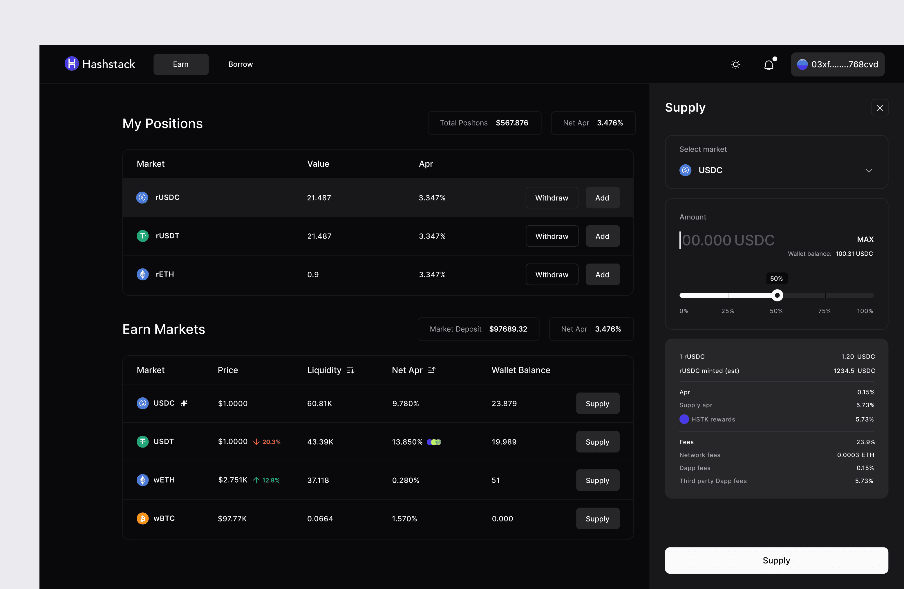
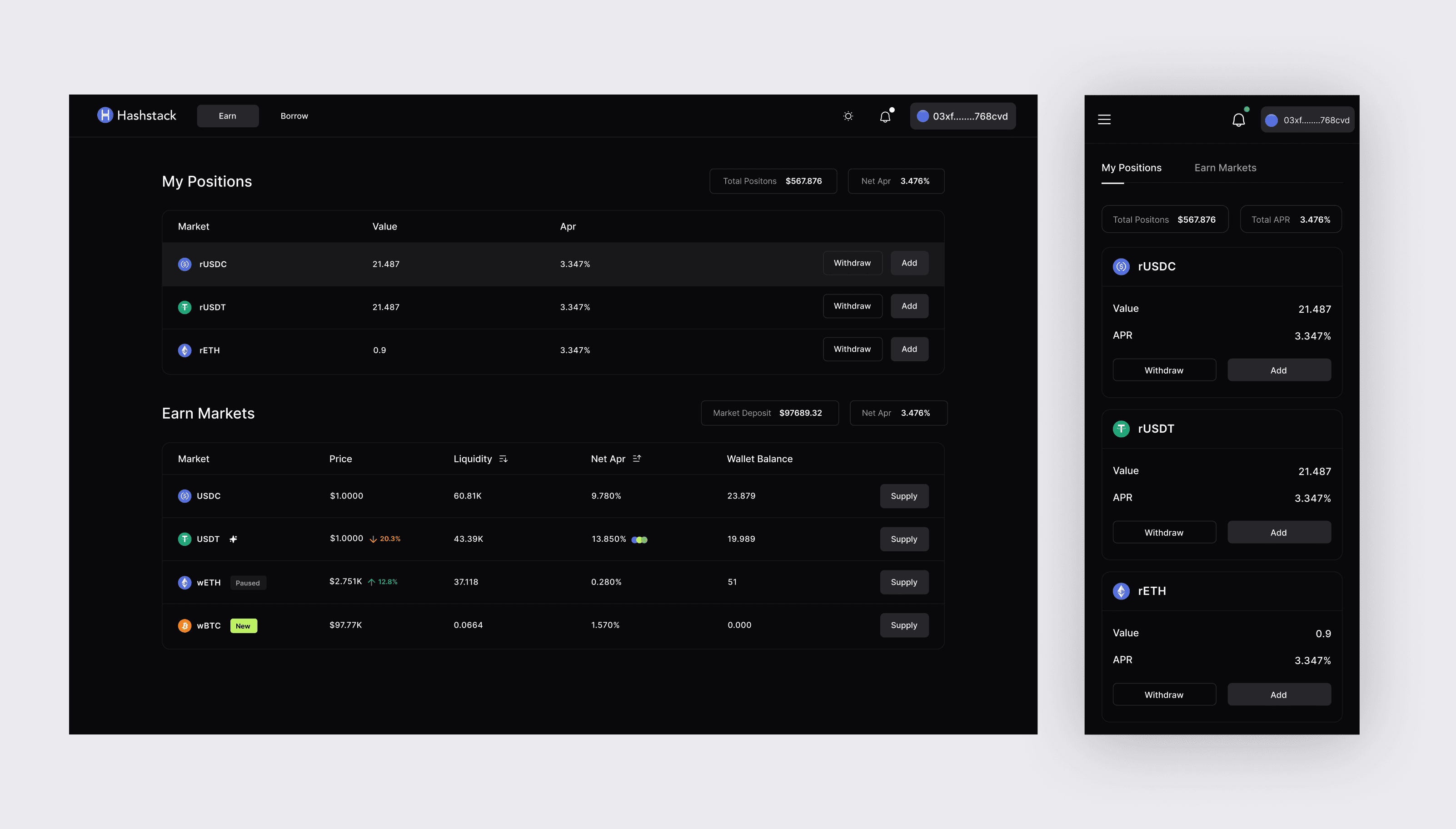
1. Intent-based sections (Earn / Borrow).
2. Contextual grouping of related actions.
3. Reduced navigation complexity.
User flows were disconnected
Problem
Actions like repay, withdraw, and supply were spread across multiple screens.
→ Users had to jump between pages to complete a single task.
Decision
Unify core actions into a single interface.
Why
Reducing navigation improves clarity and task efficiency.
Solution
1. Single consolidated table view.
2. Context-aware actions.
3. Eliminated multi-step navigation across screens.
Users lacked visibility into their positions
Problem
There was no clear way to track borrowed assets, collateral, or performance.
→ Users couldn’t confidently manage their positions.
Decision
Introduce a centralized view of user state.
Why
Visibility builds confidence, especially when users are dealing with real money.
Solution
1. Real-time tracking of borrow and earn positions.
2. Clear summaries of performance.
3. Comparative insights for decision-making.

Technical language created barriers
Problem
Terms like “Collateral” and “Staked” lacked context.
→ New users struggled to interpret actions.
Decision
Simplify terminology and provide contextual guidance.
Why
Understanding should not depend on prior DeFi knowledge.
Solution
1. Simplified microcopy.
2. Contextual tooltips for complex terms.
3. Consistent terminology across flows.
Visual density reduced clarity and trust
Problem
Dense layouts and outdated UI made the interface harder to scan and trust.
Decision
Introduce a cleaner, more structured visual system.
Why
Clarity directly impacts trust in financial products.
Solution
1. Increased spacing and visual hierarchy.
2. Modern, minimal interface.
3. Light and dark theme support.

Impact
Improved clarity in navigation and core actions
Reduced cognitive effort for new users
Increased confidence in managing positions
Reflection
This project reinforced a key shift —
not simplifying the protocol, but making its complexity more understandable.
DeFi systems are inherently complex, but users don’t need to see that complexity all at once.
The focus became aligning the experience with user intent, while staying true to how the system works underneath.
In financial products, clarity directly impacts trust and decision-making.
Closing notes
Designing Hashstack reinforced a simple idea — the most effective products don’t remove complexity, they make it understandable.
This principle continues to shape how I approach product design.
Currently is live on testnet:
Read Next
great!
Your monthly balance
is ₹38,000
4 uncategorised bills need a home
under budget
groceries
every month
₹
800
/
₹
5000
We’ll nudge you when only 20% (₹600) is left to spend.
Alert set for last 20%
update limit
This month’s spending story
over
1
safe
3
near limit
1
Add category

Add new category
This month
Add expense
₹
amount spent
hey sehaj,
this month’s balance: ₹1,20,000
Your total income is ₹1,70,000
Your expense finally found his home.
that expense just moved in
where it belongs
₹
50,000
set up your monthly budget
your total income is ₹ 1,70,000
set monthly budget
Smart Move
great choice rest you can save its great
0%
100%
₹
₹
Trackup
Making budgeting usable in real life
Mobile
B2C
© 2025 Sehaj Sharma